
Recently I received a requirement to create a linear gauge, as part of a dashboard page, to be created in SQL Server Reporting Services.
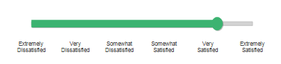
What we want to see - note the descriptive labels on the scale:
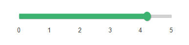
What we don’t want to see - note the actual data values on the scale:
In the dataset for the gauge, the values can range from 0 through 5. Because the number itself, like 2 or 3, isn’t meaningful to the end user, custom labels are required to translate the value into a meaningful description. Following are all of the steps to fully recreate the gauge. The good stuff – creating the Custom Labels – is in Step 9. SQL Server 2008 R2 was used for this example.
Steps to Create a Linear Gauge with Custom Labels
1. In SQL Server Management Studio, create a simple dataset which will populate the gauge. (In reality, I was using a cube built from a DW star schema, but for this example let’s keep things simple with one relational table.)
CREATE TABLE [dbo].[KPIData]
(
[MetricName] [varchar](80) NULL,
[AcademicYear] [int] NULL,
[ScaleValue] [decimal](8, 2) NULL
) ON [PRIMARY]
GO
INSERT INTO [EducationDW].[dbo].[KPIData]
(
[MetricName]
,[AcademicYear]
,[ScaleValue]
)
VALUES
('Customer Satifaction Rating'
,2010
,4.2
)
GO
2. In BIDS, within a Report Project, create a new report. Create a shared data source, and a dataset as follows:
SELECT MetricName, AcademicYear, ScaleValue
FROM KPIData
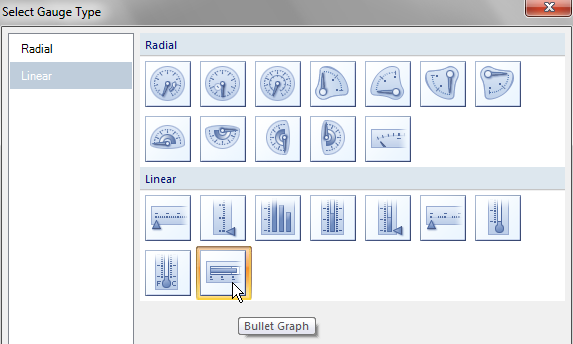
3. Drag a Gauge from Toolbox onto the body of the report. Choose the last Linear item which is called the “Bullet Graph” gauge.
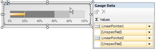
Before you do anything at all, if you click twice on the gauge to make it active, this is what it will look like:
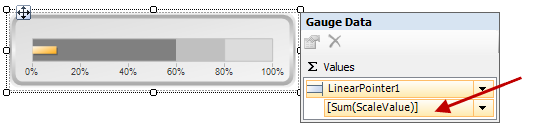
 4. Drag the “ScaleValue” field from the Report Data pane onto your Gauge. Drop it on top of the (Unspecified) item under LinearPointer1. This will set the value for LinearPointer1 to be the ScaleValue. This is our actual value (the 4.2 inserted above), which falls somewhere between the 0 and 5 range we want to display.
Click the drop-down to the right of LinearPointer2 and choose Delete Pointer. (More on using Pointer2 later in Step 8.)
If you Preview the report now, you’ll see the yellow bar is showing the 4.2 value we entered in our table. This is correct; however, by default, the scale goes to 100 and is based on percentage – neither of which fit our circumstances.
Note that clicking within different areas of the gauge will toggle between various properties.
5. Within the Gauge Scale properties, make the following changes in the properties pane:
MaximumValue: set to 5 (instead of the default 100)
LabelStyle > FormatString: set to 0 (instead of the default 0\%)
Interval: 1 (instead of the default Auto – this ensures each item from 0 through 5, our MaximumValue, will display)
IntervalOffset: 1 (instead of the default Auto – this ensures that no interval items are skipped before the first label is displayed)
6. Within the Gauge Scale Range properties, make the following changes:
EndValue: 5 (instead of the default 60)
If you Preview the report now, your gauge should look like this at this point:
7. Next let’s make a few cosmetic updates. Within the Gauge Scale Range properties, make the following changes:
FillColor: LightGrey
EndWidth: 5
StartWidth: 5 (although it says width, this means height since our gauge is horizontal)
Within the Gauge Pointer properties (for LinearPointer1), make the following changes:
FillColor: MediumSeaGreen
FillGradientType: None
Within the Linear Gauge properties, all under BackFrame, make the following changes:
BackgroundColor: NoColor
BackgroundGradientType: None
FrameColor: NoColor
FrameGradientType: None
8. Now it’s time to add the circular end to the far right of the bar. Right-click the gauge and choose Add Pointer.
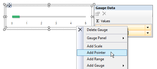
Drag the “ScaleValue” field from the Report Data pane onto your Gauge. Drop it on top of the (Unspecified) item under LinearPointer2. This will set the value for LinearPointer2 to be the ScaleValue. This may seem a little strange, considering that usually a 2nd pointer is more typically used to show a target for comparison to actuals. However, in our circumstance we’re going to use the second pointer in order to accentuate the end of the bar with a circle. This matches the drawing I received as part of requirements.
Within the Gauge Pointer properties (for LinearPointer2), make the following changes:
Type: Marker
MarkerStyle: Circle
MarkerLength: 18
Width: 15
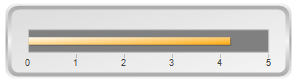
If you Preview the report now, your gauge should look like this at this point:
Finally! It’s time for the Custom Labels! Now, the task is to show descriptions rather than the value of 0-5.
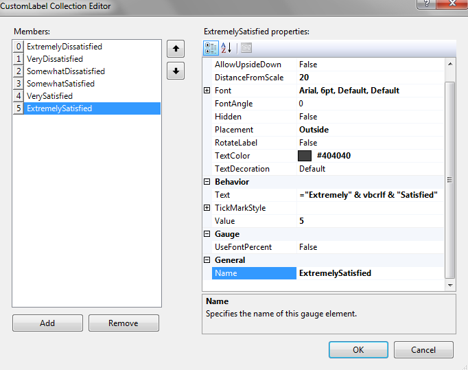
9. Within the Gauge Scale properties, click the ellipsis to the right of the CustomLabels property. This will launch the Custom Label Collection Editor.
Click the Add button. Set the following properties:
DistanceFromScale: 20
FontSize: 6pt
Placement: Outside
TextColor: #404040
Text: ="Extremely" & vbcrlf" & "Dissatisfied" (This is what will read on the scale label – because the desired labels are a little long, we need to enforce a carriage return within the expression - see Creating a Line Break Within an SSRS Expression for more information.)
TickMarkStyle:
BorderStyle: None (this will eliminate the small little boxes which display in the center of the scale by default)
FillColor: NoColor
Value: 0 (this is the scale value item for which this text is associated with)
Name: ExtremelyDissatisfied (same as the Text, just without any spaces – this is the Member name on the left side of the CustomLabel Collection Editor pane)
Repeat the above 5 more times (painful, yes I know!) with only these variations:
Text: "Very" & vbcrlf & "Dissatisfied"
Value: 1
Name: VeryDissatisfied
Text: "Somewhat" & vbcrlf & "Dissatisfied"
Value: 2
Name: SomewhatDissatisfied
Text: "Somewhat" & vbcrlf & "Satisfied"
Value: 3
Name: SomewhatSatisfied
Text: "Very" & vbcrlf & "Satisfied"
Value: 4
Name: VerySatisfied
Text: "Extremely" & vbcrlf "Dissatisfied"
Value: 5
Name: ExtremelyDissatisfied
The Custom Label Collection Editor should look like this when you have completed the entries:
You’re finished! Preview the report, which should look as follows:
Limitations
In the Custom Label Collection Editor, the Text and Value properties require a scalar value. Although it is possible to use an expression in both properties, I have yet to be successful in associating them to a query. Ideally, I’d like to have a separate dataset which serves as a lookup between the Text and the Value. At this point, I am settling for the custom labels to be hard-coded. If anyone has a solution for making them more data-driven, I would sure love to hear it!
Finding More Information
Dundas Gauge for Reporting Services