
The day 2 keynote at the PASS Business Analytics Conference is with David McCandless. I'm thrilled to be part of the live-blogging group, so I'll do my best to communicate what's happening for those who couldn't join us in San Jose.
About David McCandless. David (Bio | Blog) is an information designer, author, and data journalist from London. He writes for The Guardian sometimes, which has a great Data Store of journalism articles + accompanying data to download.
Live blog of the keynote

Denise McInerney
8:06 - Welcome for David McCandless.
David McCandless
8:08 - Hello! Has a passion for collecting and organization of data. Gathering the data and visualizing it in graphical images anyone can understand. Strange and interesting and imaginative things can happen.
8:10 - Billions of numbers of dollars. These numbers are routinely circulated but are too big to get our heads around. Shows the Billion Dollar-o-Gram. American people give over $3 Billion a year to charities. It's the connections between the data that make it interesting.
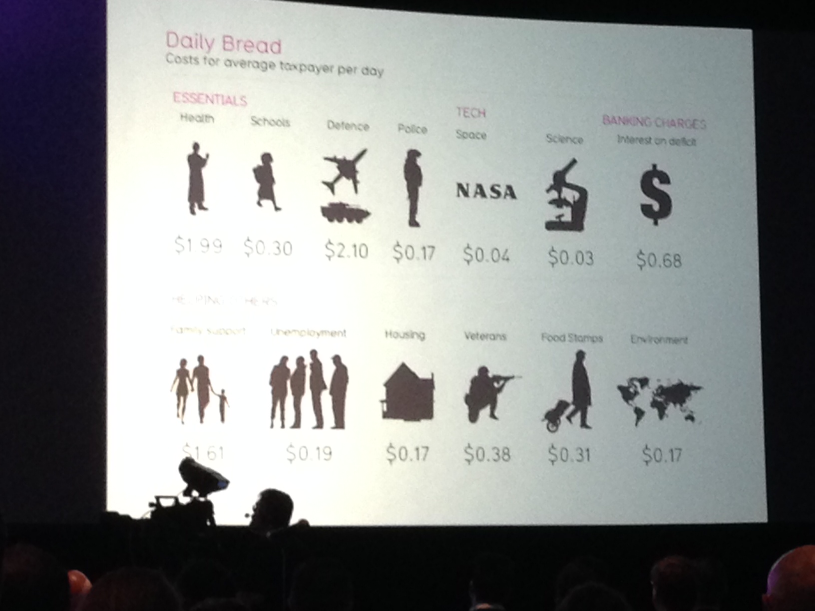
8:11 - How to bring this data down to where we can relate to it? Converted some of the same numbers to a metric we can all relate to. How much taxpayers pay into each area per day. Goal is so we can more readily relate to it.
8:12 - Playing an animation called Debtris.
8:14 - Love to play with data, have fun with it, see where it leads. Tries to use it for storytelling & finding underlying patterns. Showing a timeline of the world's biggest fears over the years. Then shows a pattern for violent video games - there's a regularity to it with twin peaks every year in November & April. The Columbine shooting has been linked to violent video games. These kinds of patterns won't emerge in a spreadsheet; you have to visualize it to see it.
8:17 - There are stories and patterns lurking in vast data sets to be used and examined. Showing a new visualization that shows two big peaks per year & mini-peaks each Monday. Asking audience who has seen this visualization before. Turns out it's most common break-up times. Includes spring break, april fools day, summer, and right before holidays. This is according to Facebook status updates.
8:20 - Phrase that "data is the new oil." It's a resource. David would adapt it to be "Data is the new soil" in that it's a material to get your hands dirty with & nurture & bloom.

8:21 - The term Big Data is confusing because it's both a noun and a verb. Big Data is many processes - gathering, handling, structuring, examining, discovery, and delivery. Many companies circulate in the top regions.
8:22 - Recently David was investigating if horoscopes all say the same thing? Did a word frequency analysis. Used Yahoo's horoscope database. If you retrieve from Yahoo's database too frequency they'll ban your IP address for a week so they had to find the right frequency to extract the data.
8:23 - Ended up boiling the horoscope down to several general statements about people being happy.
8:24 - You can learn a lot of the skills you need just by playing around with the data.
8:25 - Recently looked into who has the biggest military budget? It's the US by far. Ours is > $700 billion. But...is it true that America has the world's biggest budget? To be fair we need to ask, who spends as a proportion of their GDP? Then you get a very different picture where USA drops down to 6th. The context is what provides meaning.
8:27 - Who has the biggest army? China with > 2.1 million. But if we normalize the figure and compare to the population, then China falls to 124th and N. Korea comes to the top. US is 45th. Need context and meaning to get a clearer, truer picture.
8:28 - Hans Rosling has a phrase: "Let the dataset change your mindset." Use it to view the world more accurately.
8:30 - Looking into the # of communicating civilizations in the galaxy. Result is 46. There are 6.9 trillion galaxies in the universe.
8:32 - What is dataviz good for? Reframing, finding patterns, analysis, normalizing, contextualizing, and pimping.

8:33 - Looking at his visualized CV to show his work experience visually.
8:34 - David has never been to design school, never trained. Just likes to pick things up & learn by playing with it. Felt like he had an innate sense & become design-literate.
8:35 - Every day we are looking at the Internet. This is training us to look at data in design terms. Now if we visit a shoddy website, how little we trust it?
8:36 - We can process visualization many times faster than text. In data visualization, it's more memorable & impactful.
8:37 - Showing a visualization of who is suing who in telecoms. If you remove labels, your eye can focus on answering questions with size & color. Then layer on the story.
8:38 - Metaaphorically, using dataviz is like a new kind of camera.
8:39 - Looking at a visualization of drug use by country. Good laugh about the Aussies.
8:40 - Showing most popular search terms in a 'painted' visualization. More interesting to look at the information map.
8:41 - Showing a venn diagram to look at what pigs, birds, and people have in common? Flu. He calls this the "Infl-Venn-Za."
8:42 - Looking at a dataviz - if Twitter community were 100 people. Then turns to a dataviz about TV watching.
8:45 - Showing at a dataviz of the most commonly used PIN numbers. Reveals habits people have.
8:46 - Showing graphic of causes of death which was done for an art gallery.
8:47 - Goal is to 'see the invisible' in the data.
8:48 - Looking at a dataviz of supplements. Relationship between efficacy and popularity? This one graphic took two months to analyze and create. All this data is in Google Docs and open.
8:49 - You can condense a huge amount of data into a small space. Then enjoy it as if it's a painting.
8:50 - Looking at biggest data breaches.
8:51 - The active exploration & joy of interactivity. Interactive apps for storyfinding is the new frontier. It reveals the invisible.
8:52 - Qualitative can be visualized too. Showing an infographic of left & right government to compare & contrast the worlds. The same word, like equality, can have very different meanings.
8:56 - David puts his failed graphics on the web for people to learn from. An overly complex graphic just moves the problem. The graphic needs to unveiled.
8:57 - He tends to create circular diagrams, but their usability. It's beautiful, but what is going is on?
8:58 - An infographic that fills every possible space can be too overwhelming.
8:59 - A "charticle" is one that is part chart/part article. What can be removed? What works?

9:00 - What does work? Information and Design. A good visualization combines many of these things.
9:01 - Allowing yourself to play with data, get your hands dirty, helps you see what comes out. In that spirit, David wants to play a little game: the dataviz quiz. He has removed the labels & is asking the audience to say what the data is representing. Some good laughs!
9:09 - Q&A with the audience. All of his datasets are available on Google Docs. He and his team spend 80% of their time on the data, and only 20% on the visualization.