When defining a KPI in SQL Server Analysis Services, the indicators selected in SSAS are not matched precisely by a KPI-aware client application such as Excel. For some SSAS indicators, the Excel rendering is very similar; for other indicators, a close option is unavailable. The indicators Excel uses are the same as what’s used for its Icon Sets (found under the Conditional Formatting menu).
This discussion focuses on what the indicators selected in an SSAS KPI definition will look like in Excel. We will focus on Status and Trend, as shown in the following KPI configuration screen in SSAS:

KPI Properties
The 4 main properties of a KPI include Value, Goal, Status, and Trend, as follows:
Value:
Uses Indicator: No (numeric value only)
Example:
[Measures].[Growth in Customer Base]
Goal:
Uses Indicator: No (numeric value only)
Example:
Case
When IsEmpty
(
ParallelPeriod
(
[Date].[Fiscal].[Fiscal Year],
1,
[Date].[Fiscal].CurrentMember
)
)
Then [Measures].[Sales Amount]
Else 1.15 *
(
[Measures].[Sales Amount],
ParallelPeriod
(
[Date].[Fiscal].[Fiscal Year],
1,
[Date].[Fiscal].CurrentMember
)
)
End
Status:
Uses Indicator: Yes (indicator only; the numeric value of -1, 0 or 1 is not displayed in Excel)
Default Indicator: Gauge
Example:
Case
When KpiValue( "Revenue" ) / KpiGoal( "Revenue" ) > 1
Then 1
When KpiValue( "Revenue" ) / KpiGoal( "Revenue" ) <= 1
And
KpiValue( "Revenue" ) / KpiGoal( "Revenue" ) >= .85
Then 0
Else -1
End
Trend:
Uses Indicator: Yes (indicator only; the numeric value of -1, 0 or 1 is not displayed in Excel)
Default Indicator: Standard Arrow
Example:
Case
When IsEmpty
(
ParallelPeriod
(
[Date].[Fiscal].[Fiscal Year],
1,
[Date].[Fiscal].CurrentMember
)
)
Then 0
When VBA!Abs
(
(
KpiValue( "Revenue" )
-
(
KpiValue( "Revenue" ),
ParallelPeriod
(
[Date].[Fiscal].[Fiscal Year],
1,
[Date].[Fiscal].CurrentMember
)
)
)
/
(
KpiValue( "Revenue" ),
ParallelPeriod
(
[Date].[Fiscal].[Fiscal Year],
1,
[Date].[Fiscal].CurrentMember
)
)
) <=.02
Then 0
When (
KpiValue( "Revenue" )
-
(
KpiValue( "Revenue" ),
ParallelPeriod
(
[Date].[Fiscal].[Fiscal Year],
1,
[Date].[Fiscal].CurrentMember
)
)
)
/
(
KpiValue( "Revenue" ),
ParallelPeriod
(
[Date].[Fiscal].[Fiscal Year],
1,
[Date].[Fiscal].CurrentMember
)
) >.02
Then 1
Else -1
End
SSAS Status Indicators
The 9 choices in SSAS translate to 5 displays in Excel.
SSAS Status Indicator selected: Shapes, Thermometer, Cylinder, or Faces

Rendering in Excel:
Pro: Different shapes as well as different colors.
Con: Excel has no equivalent currently for thermometer, cylinder, or faces.
SSAS Status Indicator selected: Traffic light

Rendering in Excel:

Pro: Clear to understand.
Con: Difficult for color blind users to see the difference.
SSAS Status Indicator selected: Road signs

Rendering in Excel:

Pro: Different shapes as well as different colors
SSAS Status Indicator selected: Gauge, or Reversed Gauge

Rendering in Excel:

Pro: Two choices for a “more is better” type of KPI (the status arrow), or a “less is better” type (the reversed choice).
Cons: Not as clear to users what is good (the solid circle for the regular Gauge) or bad (the open circle for the regular Gauge); Excel has no Gauge equivalent to display (although, as a sidenote, I believe gauges should be used judiciously).
SSAS Status Indicator selected: Variance Arrow

Rendering in Excel:

Pro: Clear to understand.
Con: Meaning of this status arrow could easily be confused with a trend arrow.
SSAS Trend Indicators
SSAS Trend Indicator selected: Standard arrow

Rendering in Excel:

Cons: Black & white; only useful for a “more is better” type of KPI.
SSAS Trend Indicator selected: Status arrow, or Reversed status arrow

Rendering in Excel:

Pros: Clear to understand; Two choices for a “more is better” type of KPI (the status arrow), or a “less is better” type (the reversed choice).
SSAS Trend Indicator selected: Faces

Rendering in Excel:

Pro: Different shapes as well as different colors.
Con: Not the typical way that an indicator is presented.
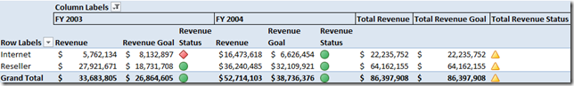
To reproduce the above in Excel, the following pivot table options were used with an Analysis Services data connection to the AdventureWorks 2008 cube:

Additional comments:
- Note that each indicator in SSAS will return 3 possibilities: red, yellow and green. Each associates to -1, 0 and 1.
- If the SSAS indicator is changed (ex: from Gauge to Shapes) in BIDS, you’ll need to (1) redeploy the cube, (2) refresh the data connection in Excel, and (3) delete the Status (and/or Trend, whichever was modified) from the pivot table and then add it back to the pivot table again. The data refresh alone won’t update the indicator image.
If you’re intending to use Excel primarily to browse the cube, I believe that the defaults for KPI indicators in SSAS should usually be changed. Personally, my favorites for Status are Shapes or Road Signs. My favorite for Trends is the Status Arrow.